Flipping branding upside down
Flipping branding
upside down
Flipping branding
upside down
Flipping branding
upside down
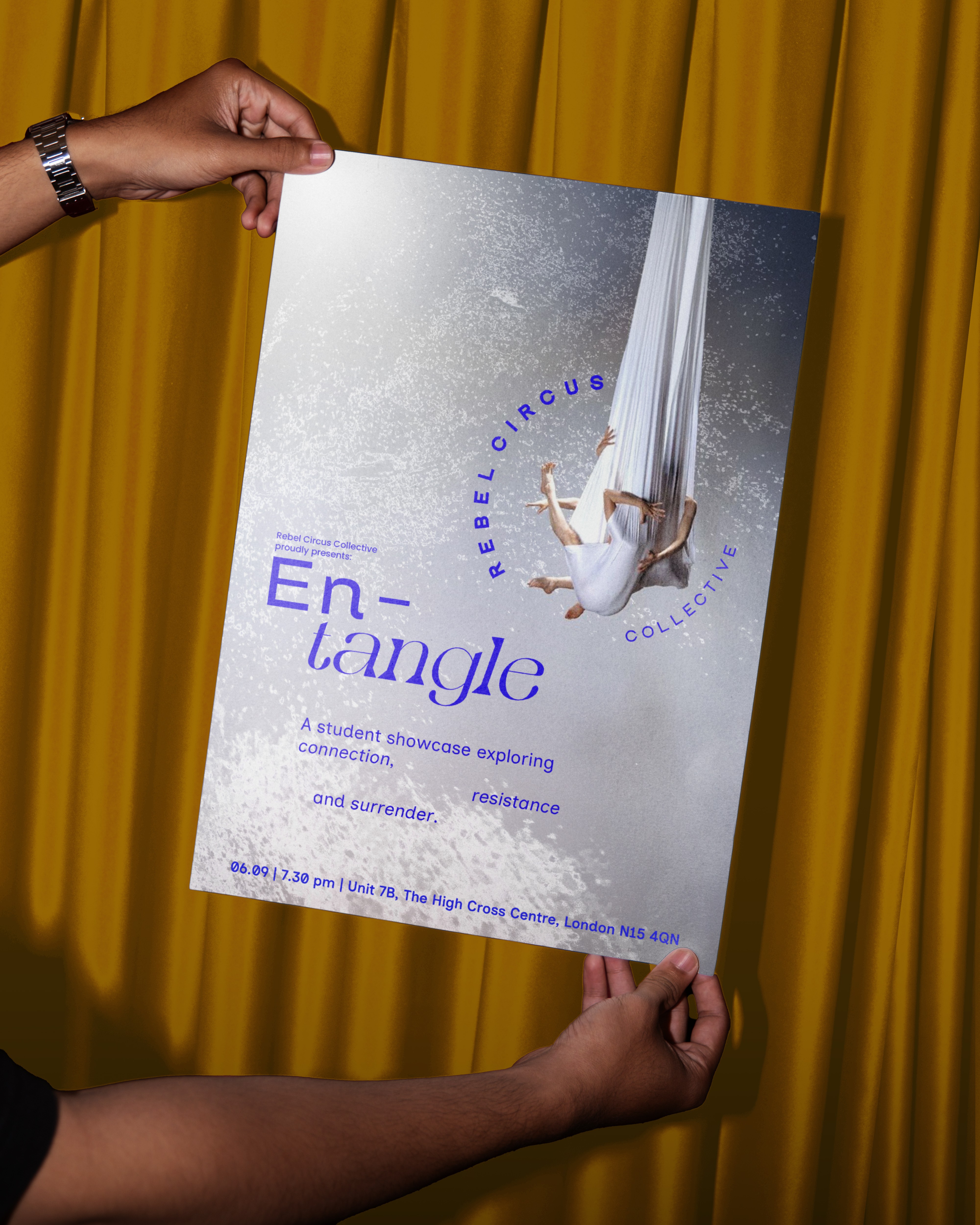
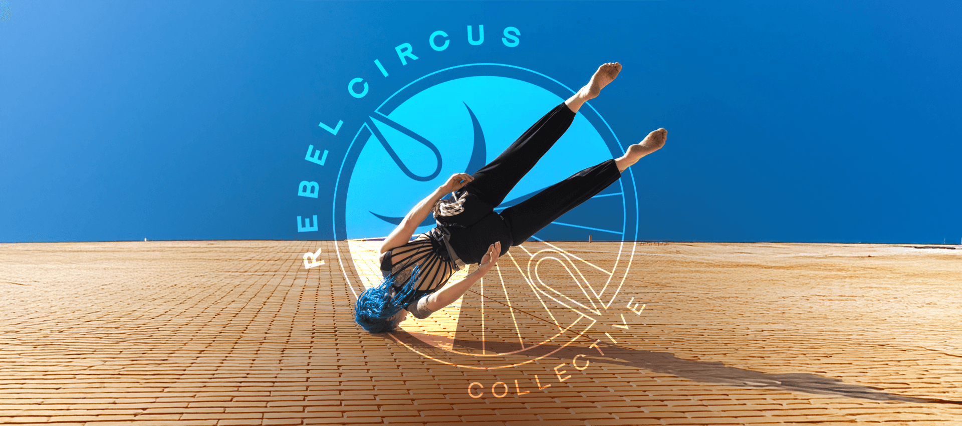
Rebel Circus Collective is a North London-based circus school and training space rooted in community, expression, and somatic movement for all, regardless of background or ability.
Founder Lindsey approached me to create a bold and modern brand identity that would mark the beginning of her solo venture. Having co-led one of London’s top aerial schools, she saw this new chapter as a personal and collective rebirth - making the rising phoenix, a symbol of resilience and rebellion, an essential element of the logo.
Rebel Circus Collective is a North London-based circus school and training space rooted in community, expression, and somatic movement for all, regardless of background or ability.
Founder Lindsey approached me to create a bold and modern brand identity that would mark the beginning of her solo venture. Having co-led one of London’s top aerial schools, she saw this new chapter as a personal and collective rebirth - making the rising phoenix, a symbol
of resilience and rebellion, an essential element of the logo.
Rebel Circus Collective is a North London-based circus school and training space rooted in community, expression,
and somatic movement for all, regardless of background
or ability.
Founder Lindsey approached me to create a bold
and modern brand identity that would mark the beginning
of her solo venture. Having co-led one of London’s top
aerial schools, she saw this new chapter as a personal
and collective rebirth - making the rising phoenix, a symbol
of resilience and rebellion, an essential element of the logo.
Rebel Circus Collective is a North London-based circus school
and training space rooted in community, expression, and somatic movement for all, regardless of background
or ability.
Founder Lindsey approached me to create a bold and modern brand identity that would mark the beginning of her solo venture. Having co-led one of London’s top aerial schools, she saw this new chapter as a personal and collective rebirth - making the rising phoenix, a symbol of resilience and rebellion, an essential element of the logo.
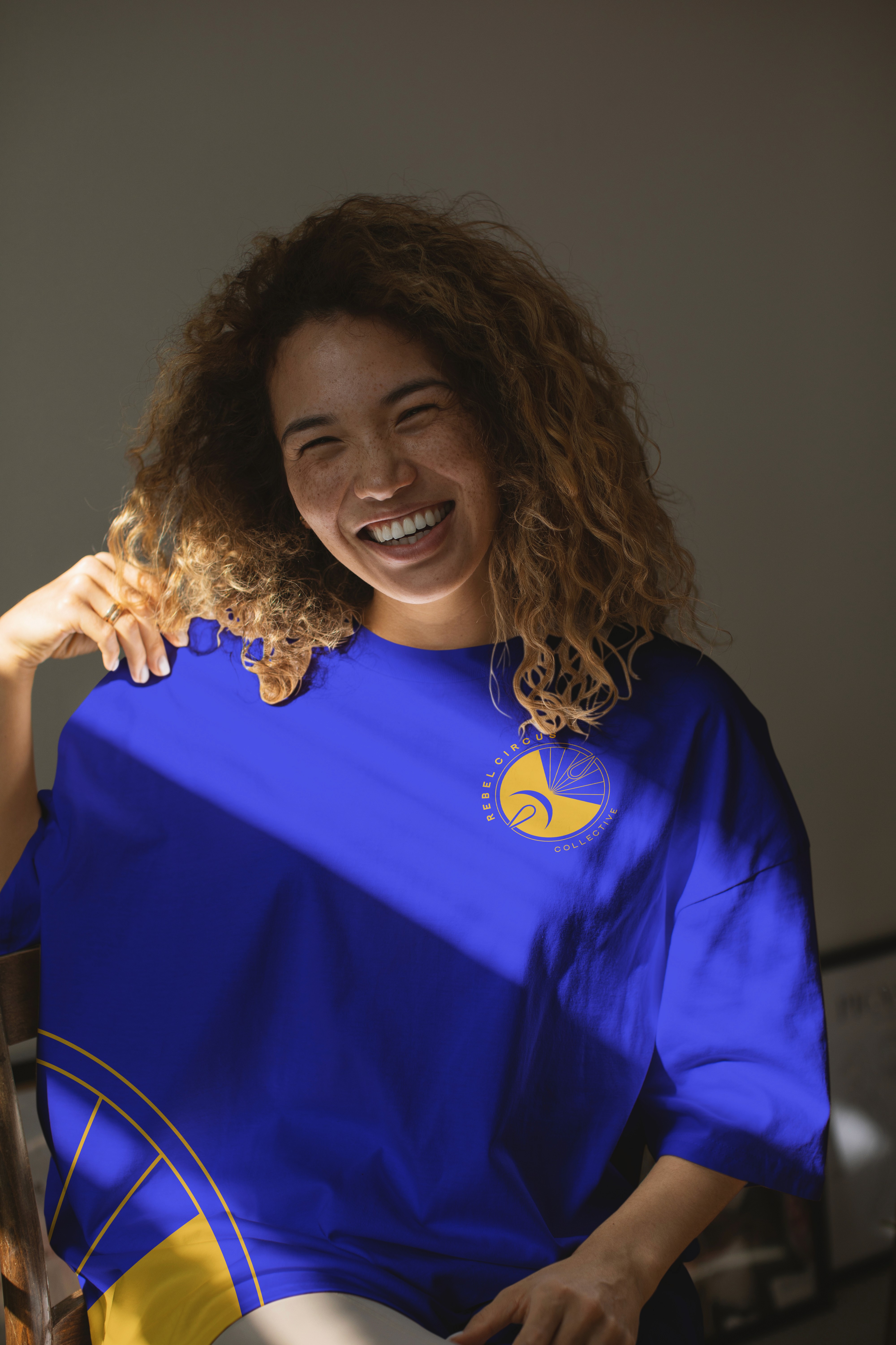
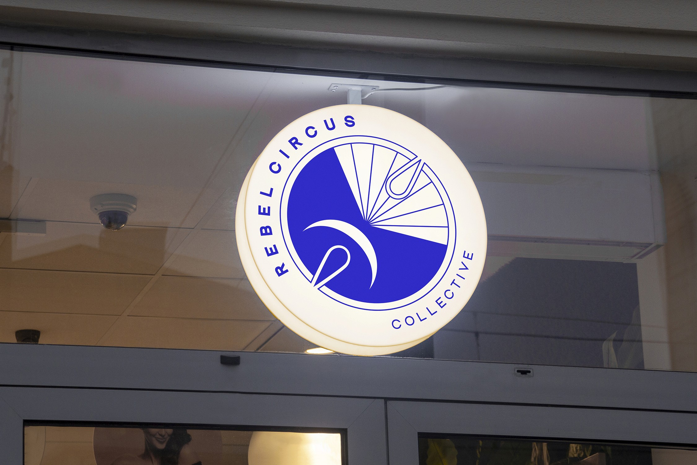
BRAND IDENTITY
BRAND IDENTITY
BRAND IDENTITY
BRAND IDENTITY
BRAND IDENTITY
BRAND IDENTITY
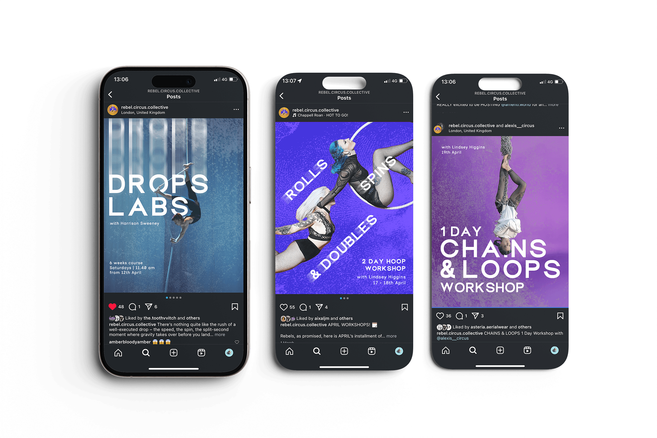
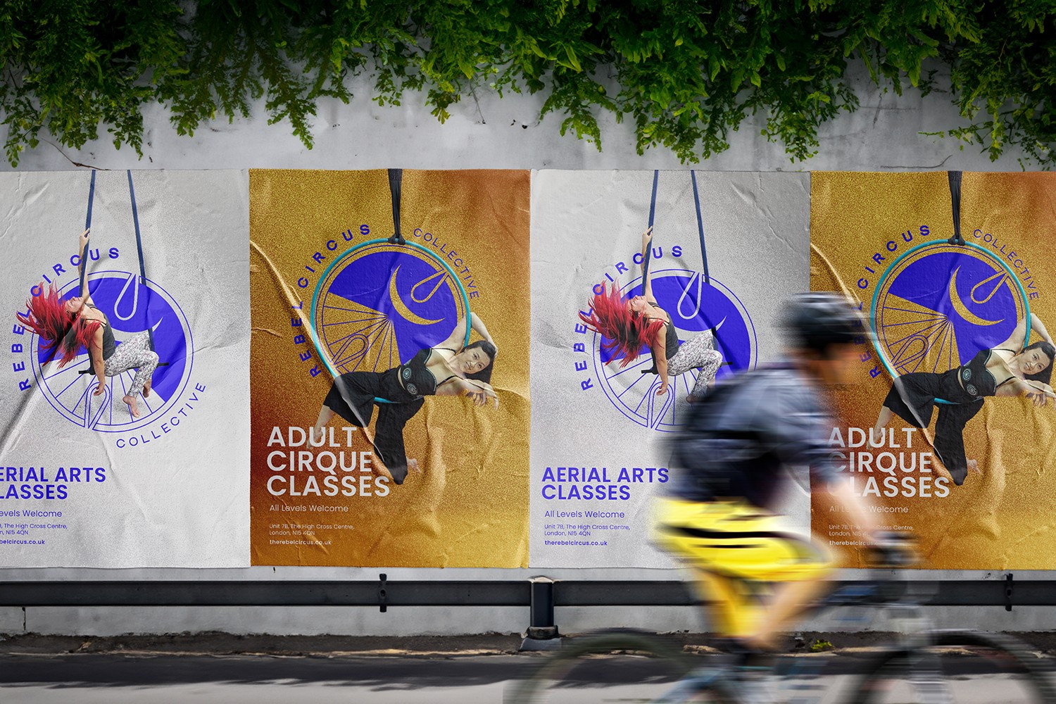
ART DIRECTION
ART DIRECTION
ART DIRECTION
ART DIRECTION
ART DIRECTION
ART DIRECTION
WEB DESIGN
WEB DESIGN
WEB DESIGN
WEB DESIGN
WEB DESIGN
WEB DESIGN
Approach
Approach
Approach
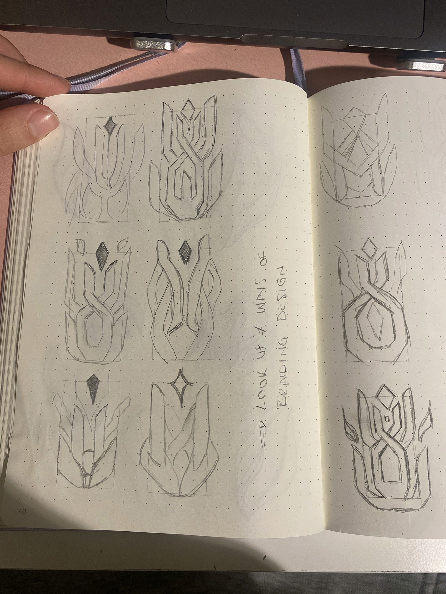
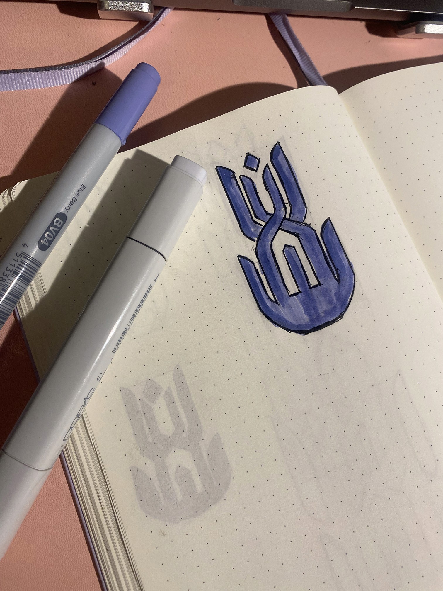
As part of the research process, I started exploring ideas to include the phoenix in the letters or to use specific aerial arts equipment, such as carabiners, to serve as the based of the abstract phoenix.
This lead to the idea of creating a mark that felt more like an obscure sygil, almost tribal, to further reinforce the belonging to an eclectic, rebellious community.


Hover to reaveal texture
Tap to reaveal texture
Tap to reaveal texture
Tap to reaveal texture


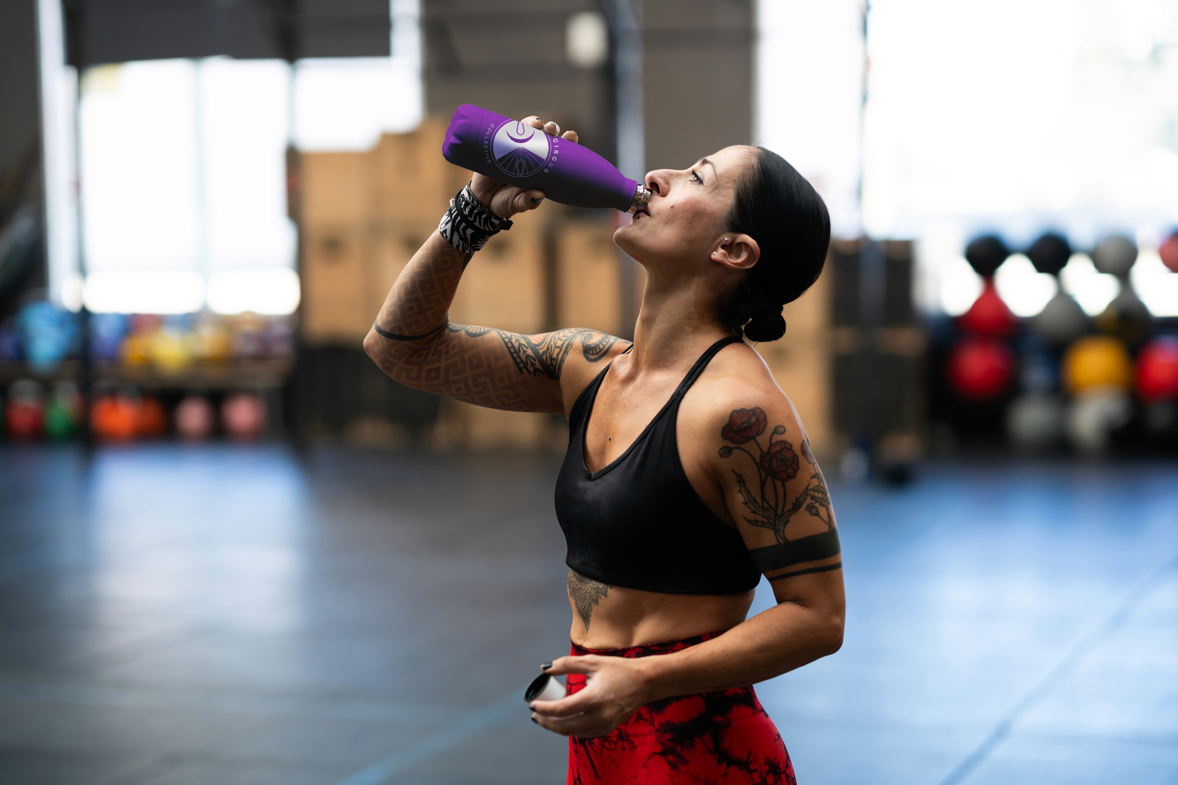
Made for & shaped by the school’s own rebels…
Made for & shaped by the school’s own rebels…
Made for & shaped by the school’s own rebels…
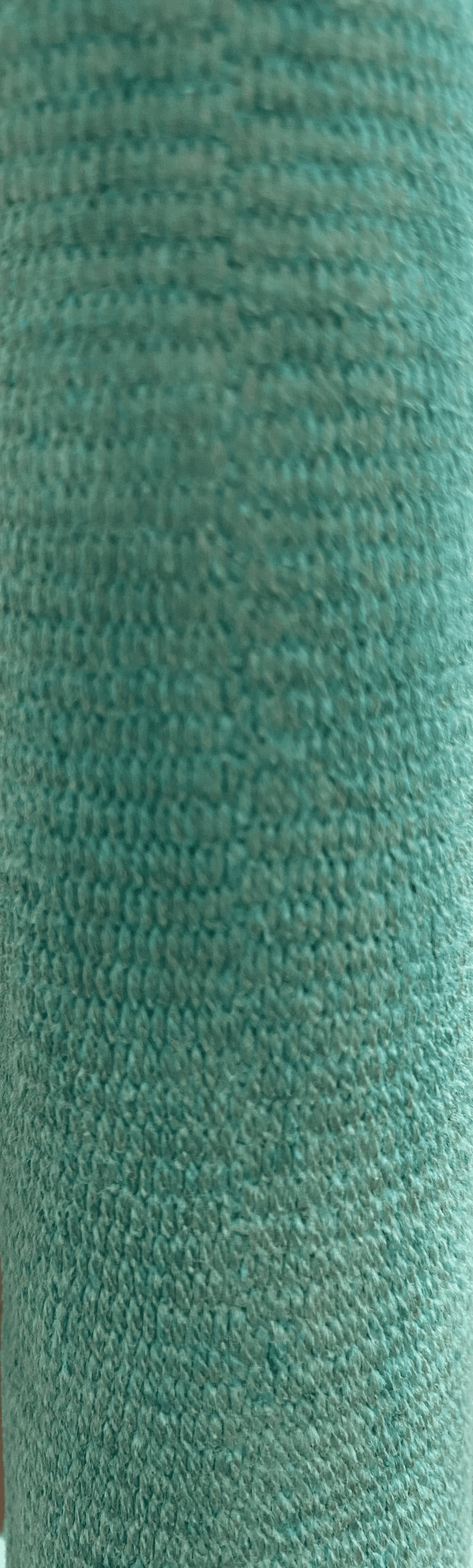
The sensorial difference between on apparatus and another as well as how your skin toughens and changes with your training is something that every aerial student is very aware and accustomed to, so I wanted to bring this dimension through the branding with a set of textures that can be used on their own or overlayed over graphics.
To create these textures, I took pictures of some students’ hands straight after they finished their class and the apparatus that they used. As community is an integral part of this school, I like the idea that students’ fingerprints were hidden throughout the branding
The sensorial difference between on apparatus and another as well as how your skin toughens and changes with your training is something that every aerial student is very aware and accustomed to, so I wanted to bring this dimension through the branding with a set of textures that can be used on their own or overlayed over graphics. To create these textures, I took pictures of some students’ hands straight after they finished their class and the apparatus that they used. As community is an integral part of this school, I like the idea that students’ fingerprints were hidden throughout the branding
The sensorial difference between on apparatus and another as well as how your skin toughens and changes with your training is something that every aerial student is very aware and accustomed to, so I wanted to bring this dimension through the branding with a set of textures that can be used on their own or overlayed over graphics. To create these textures, I took pictures of some students’ hands straight after they finished their class and the apparatus that they used. As community is an integral part of this school, I like the idea that students’ fingerprints were hidden throughout the branding